Web Design 2026: The Rise of "Warm Minimalism"
Published on January 12, 2026
Did you know that you have only 0.05 seconds to convince a visitor to stay on your website? In 2026, the battle for attention is no longer being fought on technological complexity, but on emotion. After a decade dominated by cold, clinical, and ultra-tech designs, users are saturated. They are looking for humanity.
This is where Warm Minimalism comes in. It is not just a passing aesthetic trend; it is a philosophical response to the need for authentic digital connection. If your site still looks like a sterile operating room, you risk losing your audience to competitors who have adopted this softer, more welcoming approach.
In this article, we will explore why Web Design 2026 is inseparable from Warm Minimalism. We will look at how to integrate this trend without sacrificing performance, the errors to absolutely avoid, and the tools to transform your interface into a space where people actually want to spend time.
OVERVIEW OF THE MAIN TOPIC: WHAT IS WARM MINIMALISM?
To understand the importance of Warm Minimalism in the landscape of Web Design 2026, we must first define it.
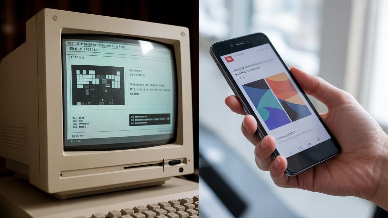
Traditional minimalism, popularized in the early 2010s, focused on the mantra "Less is More": lots of white space, strict sans-serif fonts, rigid grids, and a monochrome palette (often black and white). While effective, this style became impersonal.
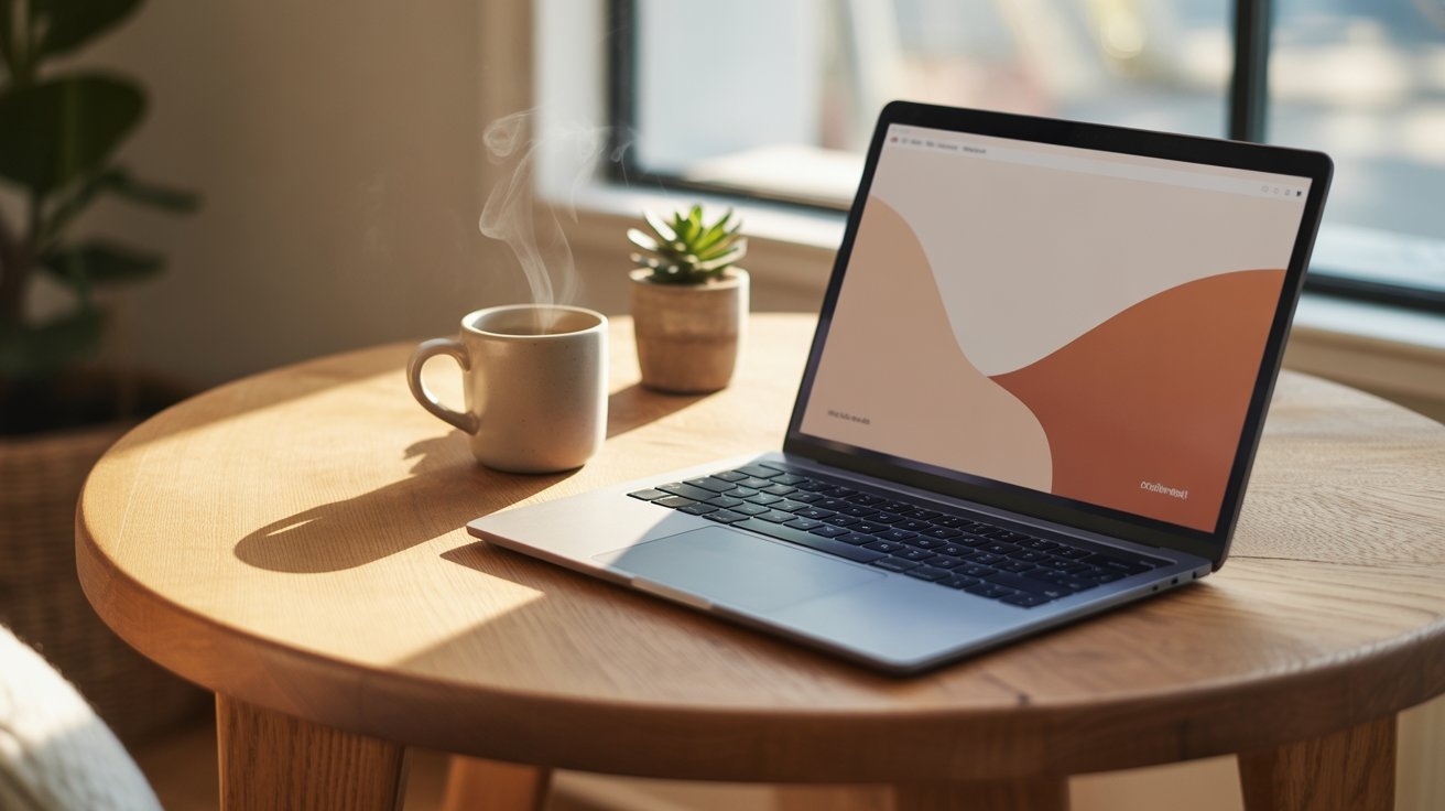
Warm Minimalism retains the clarity and simplicity of its predecessor but injects soul into it. It replaces clinical white with off-white or cream, uses typography with more character, and integrates organic shapes.
Why is this crucial today? The rise of Artificial Intelligence has flooded the web with generic content. In reaction, humans are looking for signals of "life."
- Current Trend: According to the latest UX analyses from 2025-2026, sites using "organic" palettes see a 25% increase in session time compared to cold "High-Tech" design sites.
- The Goal: To create an interface that doesn't shout, but welcomes. We are moving from pure efficiency to digital comfort.
STRATEGIES AND KEY STEPS TO ADOPT WARM MINIMALISM
Transforming your site doesn't mean redoing everything from scratch. Here is how to integrate Warm Minimalism step-by-step to stay on top of Web Design 2026.
1. Adopt an "Earthy" and Soft Color Palette
Forget pure white (#FFFFFF) and absolute black (#000000). These contrasts are harsh on the eyes and lack warmth.
- The Concept: Use colors inspired by nature.
- Practical Tips:
- Replace white with tones like "eggshell," "cream," or "linen."
- For text, prefer a dark charcoal gray or deep brown rather than pure black.
- Use accent colors like terracotta, sage green, or washed-out slate blue.
- Example: An e-commerce site selling candles would use a sandy beige background (#F5F5DC) with soft olive green action buttons.
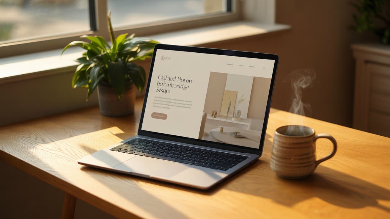
2. Typography as a Decorative Element
In Warm Minimalism, typography isn't just there to be read; it sets the tone. Soulless fonts (like default Arial) are to be banned.
- The Concept: The return of elegant and modern Serif fonts.
- Practical Tips:
- Mix an elegant Serif font for headings (H1, H2) with a clean, geometric Sans-Serif for the body text.
- Don't be afraid of large font sizes. Let the words breathe.
- Play with letter spacing (kerning) for a lighter, airier look.
3. Organic Shapes and Soft "Micro-Interactions"
Right angles and sharp points are often associated with rigor and coldness. Web Design 2026 embraces the curve.
- The Concept: Make the interface more tactile and natural.
- Practical Tips:
- Use generous "border-radius" on your buttons and images.
- Integrate abstract and fluid background shapes (blobs) instead of strict rectangles.
- Add very light grain or noise texture to your backgrounds to avoid the "plastic" effect of digital screens.
4. The Art of Negative Space
Empty space is not "nothing." It is an active design element that allows the eye to rest.
- The Concept: Fewer elements, but better arranged.
- Practical Tips:
- Increase the margins between your sections. If you think there is too much space, add a little more.
- Do not fill every corner of the screen. Let the content "float."
- Negative space highlights your main keyword and your Calls to Action (CTA) without needing to make them flashing red.
COMMON MISTAKES TO AVOID
Adopting Warm Minimalism requires subtlety. Here are the frequent traps that can ruin your Web Design 2026.
1. Lack of Contrast (Accessibility) The number one mistake is choosing colors that are too soft and blend into each other, making the text unreadable.
- Don't: Light gray text on a light beige background.
- Do: Always check the contrast ratio (minimum 4.5:1) to ensure your site remains accessible to the visually impaired.
2. Confusing "Warm" with "Cluttered" Some think that to make a site warm, they need to add decor photos everywhere.
- Don't: Overload the page with wood textures, plants, and objects.
- Do: Keep the structure minimalist. One beautiful image is worth better than ten small ones.
3. Neglecting Load Speed Adding textures (grain, paper) or heavy custom fonts can slow down the site.
- Don't: Use huge PNG image files for background textures.
- Do: Use modern CSS to generate noise/grain or optimized image formats (AVIF, WebP).
RECOMMENDED TOOLS AND RESOURCES
To succeed in your transition to Warm Minimalism, here is a selection of essential tools.
- Coolors (Free / Paid)
- Why? Ultra-fast color palette generator.
- Key Feature: You can lock an "earthy" color and generate harmonious shades instantly. Perfect for finding that "ideal beige."
- Typewolf (Free)
- Why? The reference for seeing how typographies are used on real modern sites.
- Key Feature: Discover font pairings (Serif + Sans Serif) that work best for 2026.
- Figma (Free / Paid)
- Why? The standard interface design tool.
- Key Feature: Use "Noise" or "Blobs" plugins to generate textures and organic shapes directly in your mockups.
- Unsplash ("Minimalist" Collections)
- Why? Free stock image library.
- Key Feature: Search specifically for terms like "neutral tones," "shadows," and "natural light" to avoid clichéd stock photos.
CASE STUDY: THE REDESIGN OF "TERRA CERAMICS"
To illustrate the concrete impact of Warm Minimalism, let's take the example (fictional but based on real data) of the pottery brand "Terra Ceramics."
The Problem: Their previous site was very "clean": pure white background, Helvetica font, photos cut out on white. Result: the site looked like an "industrial catalog." High bounce rate (65%).
The Web Design 2026 Solution:
- Background: Switch to a "limestone" tone (#F0EFEB).
- Typography: Use of a Serif font with strong character (like Canela or Roslindale) for titles.
- Images: Photos in natural light with soft shadows, not cut out.
- UI: Buttons with rounded edges and terracotta color.
The Results: Three months after the redesign:
- Time on Site: +40%. Users "stroll" through the site.
- Conversion Rate: +18%. The emotional aspect of the product is better conveyed.
- SEO: Improved ranking on keywords related to "artisan ceramics" thanks to better user retention (Dwell Time).
CONCLUSION
Web Design 2026 is not just about technical prowess; it is an emotional return to roots. Warm Minimalism is the perfect answer to a saturated digital world: it offers a visual refuge that is calm and authentic.
By adopting natural palettes, expressive typographies, and letting your content breathe, you are not just "decorating" your site. You are creating a User Experience (UX) that inspires trust and serenity. Remember: in a noisy world, it is often the one who whispers that is heard best.
Ready to warm up your brand image? Start today with a simple action: audit the homepage of your site. If the background is pure white (#FFFFFF), try changing it to off-white (#FAFAF5) and observe the immediate difference in feeling.
FAQ: Frequently Asked Questions about Warm Minimalism
Is Warm Minimalism suitable for all industries? Almost. It is ideal for lifestyle, health, "ethical" tech, and craftsmanship. However, for very institutional or emergency sectors (strict banking, security alerts), a classic, high-contrast minimalism may remain preferable to maximize immediate clarity.
Does adding textures slow down my website? It is a risk if done poorly. To stay performant in Web Design 2026, do not use heavy images for the background. Prioritize CSS or SVG files to create grain or organic shapes. This ensures fast loading.
What is the difference between Boho style and Warm Minimalism? Boho style is often maximalist (lots of patterns, colors, objects). Warm Minimalism remains... minimalist. It keeps the clean structure and order but simply changes the mood through colors and materials. It is order with warmth.
How to choose the right font for this style? Look for fonts that have "personality." Serif fonts (with feet) that remind you of old books or fashion magazines are perfect for titles. Just make sure they remain readable on mobile.
Comments
Be the first to comment on this article.
Leave a Comment